
Brief
Since 2006, Cap Digital supports the development of the digital economy by bringing together start-ups, research laboratories, businesses, universities and investors. FCINQ was tasked with redesigning its website, both for desktop and mobile, to clarify its mission and highlight its successes.
They made it
Lot of people have been working on this project, here is our part of people working on it.
-
 Priscillien Gac
 -
 Gwendoline Gendron
 -
 Jérémy Petrequin
 -
 Quentin Sautour
Rethink and simplify access to content
The previous Cap Digital site no longer corresponded to its image as a key player in the digital infrastructure economy and did not clearly distinguish its fields of action. The idea was to first propose a major overhaul of the site in order to make it more readable, and lay the foundations for a digital ecosystem including Cap Digital, Futur.e.s & EdFab sites and connected to the publications center and the Connect directory.

A collaborative effort
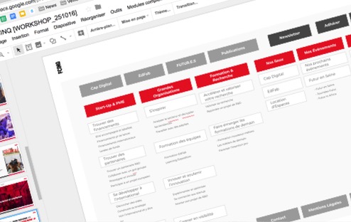
The design work was carried out in close collaboration with the Cap Digital team: we laid the foundations with the empathy maps around the 3 profiles, then refined them together over the course of several workshops. The workshops were also an opportunity to define the promise of the site, which then led us to create the site map and the resulting content strategy.

Modernizing Cap Digital's image
Our design thinking was focused around the will to provide Cap Digital with a digital tool that lives up to its reputation, in order to leave a mark. We achieved this primarily with the use of large typography, in a headline style, and the reworking of the colors: the red was softened to make it less aggressive to the eyes, and add a complementary color, in this case blue, to add contrast. Finally, we refined the animations (parallax, hovers), in order to create a pleasant and smooth browsing experience, one that does not take precedence over the content.
